PTE Academic describe image
Describe image sample response
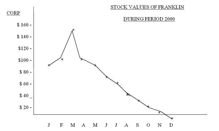
The line graph illustrates the share prices of Franklin in dollars for a period of 12 months in 2000. It is immediately evident that in January the share price was nearly $90 and reached a peak of around $150 in March. However, thereafter the share prices consistently plummeted and by December the share prices were at negative level. To conclude, generally the Franklin stock values showed a decreasing trend over a 1 year time frame.
PTE Academic describe image
Describe image sample response
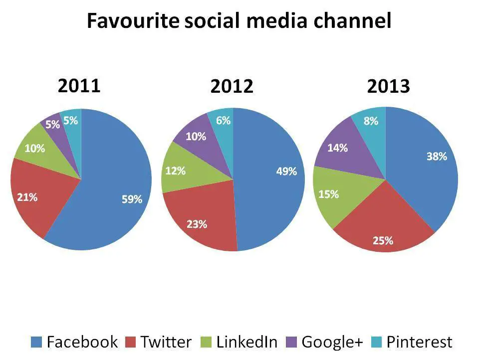
The three pie chart shows the most popular social media channel between 2011 and 2013.It is immediately apparent that Facebook was the most favourite social media channel, but its popularity declined over the time frame. On the other hand twitter and LinkedIn showed a similar increasing trend and stood between 15 and 25 percent. Finally a small proportion of Google plus and p interest was viewed. To conclude Google was the most favourite, while Pinterest was least browsed.
PTE Academic describe image
Describe image sample response
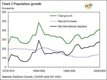
This graph shows the growth of the population in Canada from 1978 to 2009. It is taken from the website about Statistics in Canada.
There are three graphs in the chart. The green graph shows the total growth of the population, the black one deals with the migrated people in Canada and the blue graph shows the natural increase of the population. In 1988/89 there was an enormous growth. In the following years the total growth went down to about 250,000 in 1998/99. From that time on the Canadian population has been gradually growing again although the natural increase slows down. So we can say that the growth of the population in Canada is based on migration.
MORE LINKS:
PTE Academic speaking describe image tips for easy explanation
Latest PTE Essay Topics for PTE Academic writing
Please click for Summarize written text sample paragraphs