PTE Academic Speaking describe image sample response
Describe image sample response
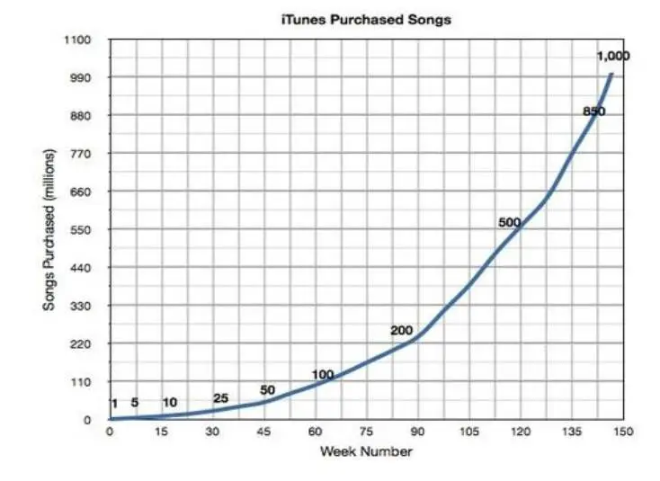
The line chart displays the purchased from Itunes, comparing the number of weeks to the songs purchased in millions.
It had a steady growth from the first week to week 90 reaching 200 million purchases, each ,but from that point onwards it has taken a huge climb and reached one thousand million purchases before reaching 150 weeks,
Describe image sample response
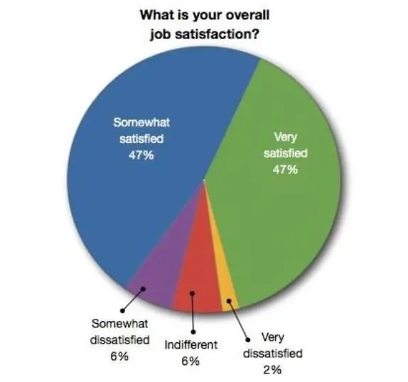
The pie illustrates overall job satisfaction.It is immediately apparent that somewhat satisfied and very satisfied had taken significant majority claiming each, secondly somewhat dissatisfied and indifferent claiming 6 % each.while very dissatisfied has taken a insignificant percentage of 2 %.
Describe image sample response
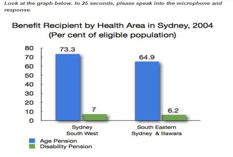
The Bar graph illustrates the type of pension in specific two areas of Sydney and its measured in percentage.
Firstly , Sydney south west the age pension and disability pension are receipted by 73.2 % and 7 % respectively , In comparison South eastern Sydney and Illawara has recorded 64.9 % and 6.2 % respectively for the same categories.
Please comment and share
MORE PRACTICE LINKS:
PTE Academic speaking describe image tips for easy explanation
Latest PTE Essay Topics for PTE Academic writing
PTE Reading Tips- How Solve Fill in Blanks- get higher marks
PTE-Academic Useful Tips For Listening Section
Click for more PTE Academic practice material