PTE Academic Speaking Describe Images
PTE Academic Speaking Describe Images. There are various types of charts.
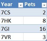
In the following example, we show the numbers of pets in Year 7 of a school.
Types of describe images in PTE Academic speaking
List with phrases to describe charts
• The pie chart is about …
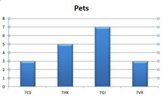
• The bar chart deals with …
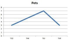
• The line graph (clearly) shows …
• The slices of the pie chart compare the …
• The chart is divided into … parts.
• It highlights …
• … has the largest (number of) …
• … has the second largest (number of) …
• … is as big as …
• … is twice as big as …
• … is bigger than …
• more than … percent…
• only one third …
• less than half …
• The number … increases/goes up/grows by …
• The number … decreases/goes down/sinks by …
• The number … does not change/remains stable
• I was really surprised/shocked by the …
• So we can say
Related Links:
Use of Tenses
Mind the correct use of tenses when describing a chart. If the charts deals with facts in the present (as in our example), use the Simple Present, if the facts are the past, then use the Simple Past. If there is a connection between the past and the present, use the Present Perfect.
How to describe a chart
With the following example, we would like to show you how charts are described. Mind the three parts and do not repeat the global message in the conclusion.

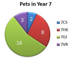
A. Pets in Year 7 at a school
We have chosen the pie chart because we think it shows the number of pets in Year 7 best.
1 Introduction
Here you say what the diagram is about. Mind the title of it and do not forget to include the source.
The pie chart is about pets in Year 7. The chart is divided into 5 parts. It is taken from.
2 The message of the diagram
The largest number of pets are in form 7GI. There are 16 pets.
The second-largest number of pets are in form 7HK. There are 8 pets.
So there are more than twice as many pets in form 7GI.
The chart shows that there are only 2 pets in form 7CS and 3 in form 7VR.
3 Conclusion
So we can say that the most pets of Year 7 are in form 7GI and the least in form 7CS. There are more than 50 per cent of all the pets in one form – form 7GI.
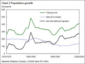
B. Population growth in Canada
This graph shows the growth of the population in Canada from 1978 to 2009. It is taken from the website about Statistics in Canada.
There are three graphs in the chart. The green graph shows the total growth of the population, the black one deals with the migrated people in Canada and the blue graph shows the natural increase of the population. In 1988/89 there was an enormous growth. In the following years, the total growth went down to about 250,000 in 1998/99. From that time on the Canadian population has been gradually growing again although the natural increase slows down. So we can say that the growth of the population in Canada is based on migration.
RELATED LINKS:
Top tips to improve your English to speak fluently | English Speaking Tips
PTE SPEAKING DESCRIBE IMAGE TIPS
Please click for PTE Academic read aloud samples