Look at the images below and describe in detail what the image is showing.You will have 25 seconds to describe image.Sample answers are given for practice purpose only.
1.
Describe image with sample answers
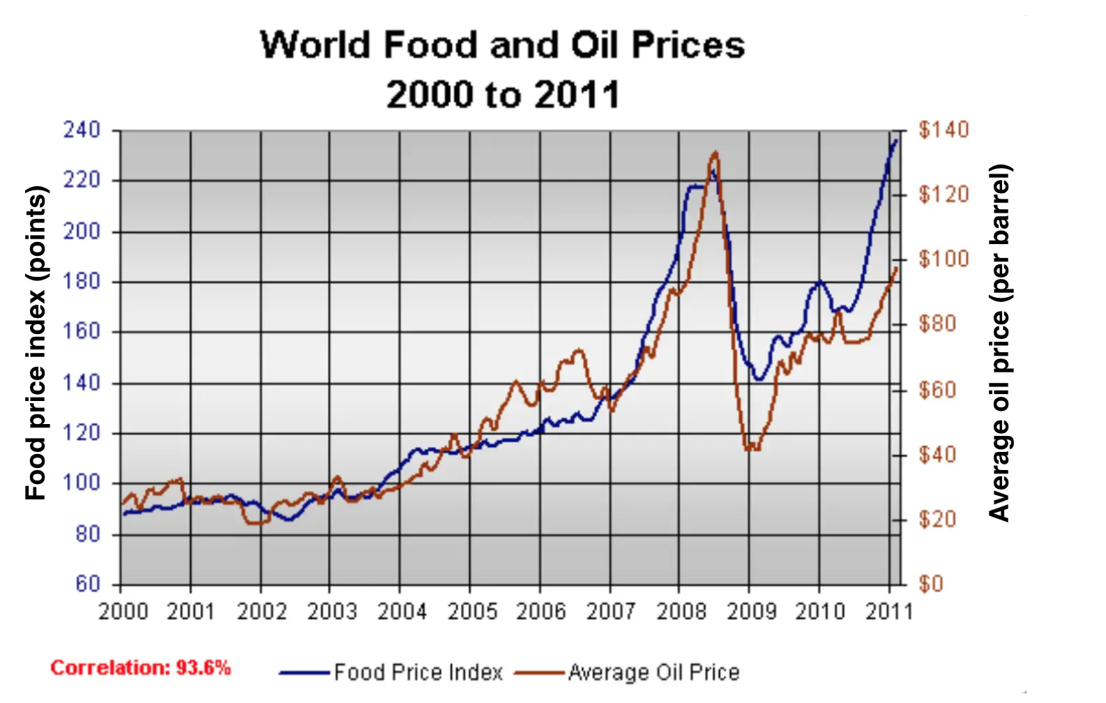
The line graph compares worldwide prices of food and oil from 2000 to 2011.
It is clear that overall prices for both food and oil increased dramatically over the period shown. Also, the figure for food was higher for most of the period.
In 2000, the average price of a barrel of oil was around $95, whereas the figure for food price index stood at about $90. Over the next 8 years, there was a significant increase in the price of oil, to reached its highest level at approximately $230 per barrel, compared to about $220 for food in the year 2008.
Over the following three years, the figures for both food and oil fluctuated. By the year 2011, the food price peaked at around $140, By contrast, the figure for a barrel of oil fell to just under $100.
RELATED LINKS:
PTE Academic speaking describe image test tips
2.
Sample answer describe image
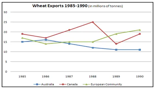
The line graph illustrates the exporting patterns of wheat of Australia, Canada and the European Community during a time span from 1985 to 1990.
Canada was the leading country in the wheat export market in 1985 with slightly under 20 million tonnes of wheat exported. Australia traded the least wheat in 1985 (15 million tonnes), falling not a big gap behind the European Community (about 17 million tonnes). Interestingly, one year later in 1986, Australia surpassed the European Community as the second leading country in exporting wheat, while Canada maintained its position.
In the next two years in 1988, Canada’s wheat exports reached an all-time high of 25 million tonnes, leaving the other competitors a long way behind. The year 1989 was noticeable in that both Canada’s wheat export and Australia’s stood at their lowest points with Canada trading only 14 million tonnes and Australia trading slightly over 10 million. During the period between 1986 and 1990, the European Community’s wheat export experienced an upward trend, ultimately ending as the market leader in 1990 with over 20 million tonnes, followed by Canada (slightly under 20 million tonnes) and Australia (over 10 million tonnes).
MORE PRACTICE LINKS:
PTE READING REORDER PARAGRAPHS PRACTICE EXERCISES
PTE LISTENING REPEAT SENTENCE PRACTICE SAMPLES
CLICK FOR PTE WRITING SOLVED ESSAYS