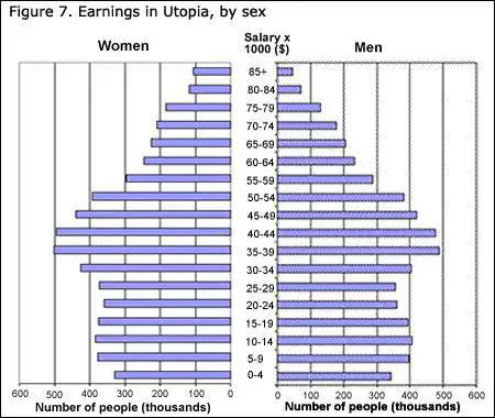
PTE Academic describe image with answers
Describe image sample responses
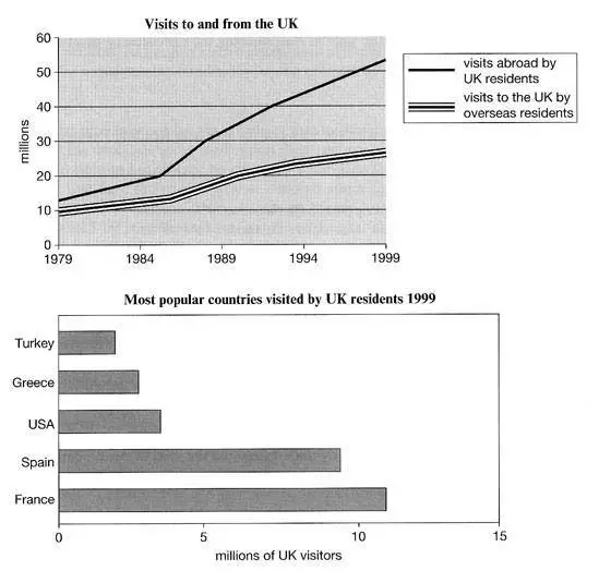
1.The graph explains the trend of UK visitors outbound and inbound to the UK from 1979 to 1999.As we see, the UK residents visit abroad was increased drastically from just over 10 million to around 50 million in these 20 years . And, at the same time, the number of visitors to the UK has a study increase from 10 million to 30 million. In 1999 , more than 10 million UK residents visited France , which is highest when compared with other countries in the graph.
2.The line graph elucidates the number of visitors comes in England and English people traveled other countries. It is clearly seen that English people travel more than an overseas resident. In 1979 more than 10 million English people travelled abroad and swelled significantly year by year and ended up more than 50 millions in 1999. On the other side, overseas people started with 10 million and increased gradually and reached to 28 millions in 1999. Moving on, vertical bar graphs depicts the favourite countries visited by English people. It is clearly observed that first place France more than 10 millions travelled and than Spain and least travel countries were Turkey and Greece less than 5 millions. Therefore, we can say that France is the favourite country for UK residents among other countries.
PTE Academic describe image